Statement
The Color of Place
Watching a saffron yellow curtain blowing in the breeze at a temple entrance in the Tibetan region of Nepal emphasized the importance of color as an invitation to a sacred space. The glimpses of ornate frescos and praying monks that this curtain both revealed and concealed showed how crucial the symbolism of color is in this harsh Himalia environment. I had been trekking with a few artists for several days in what is called the rain shadow side of Annapurna Three visiting monasteries in small villages on our way to the Nepalese Tibetan capital of Lo Manthang. Lamas in their red robes traversing paths stand out amongst the wind exposed earth where sides of mountains and dried riverbeds reveal centuries of plate tectonic shifts. The reds and the yellows are punctuations, even exclamations in this place.
Conversely, the calming blues of indigo helped define my time in Japan where I was learning the fine art of washi papermaking and able to spend time with an indigo dye bath.
Indigo requires fermentation and oxidation for the blue to affect a material. The more an item is dipped into the dye bath and then exposed to air the darker it becomes. The Japanese use indigo dyed fabric as entrances to business, the fabric you walk through to enter a restaurant or shop. Historically work clothes were made of indigo dye fabric and patched and treated with respect some of this cloth has become treasured artifacts, referred to as Boro.
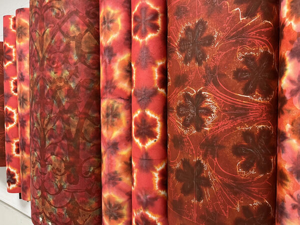
In this exhibition all the work is made of Washi (Japanese paper). The sheets are usually printed with a pattern first. These are woodblocks that I have hand cut, laser cut, or CNC routed. They are all hand inked, in this case with blacks, reds, and white printing ink. After the ink is dry the paper is folded, dyed (sometimes with fiber reactive dyes other times with sumi ink) which layer another pattern that seeps into the paper around and underneath the printed elements. Many works have bamboo added to create structure that allude to prayer flags, lanterns and gates.
The printed patterns on the installation entitled Madder are inspired from photos I took of wooden carved balcony banisters in Katmandu. Each appeared unique and different not unlike the catalogue of iron railings here in New Orleans. The color madder is derived from madder plant (Rubia tinctorum) which gives it a warm orange red quality.
The white ink is printed first on Saturate 2.0 and then it was dyed in several shades of blue. The patterns are more geometric in this piece, utilizing ovals and triangles that contrast with the softer infiltration of the blue dye into the paper. Because the ink is oil based it acts as a resist to the dye but because of the intensity of the pigments they stain the white ink creating a wealth of tones.
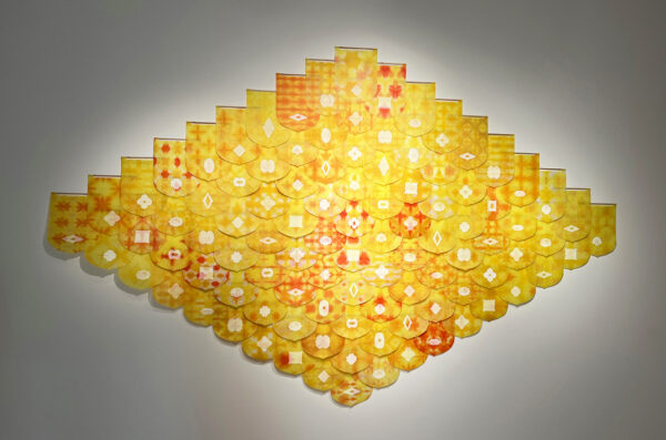
Saffron was created as a memorial for victims of the 2015 earthquake in Netal, to honor those who were lost. It is active, animated and constantly moving like an ever-vigilant flame. The yellow harkens back to the temple entrance curtain always moving in my memories.